

A wireframe is a rough, low-detail layout of a screen — boxes, lines, and placeholder text standing in for real content and visuals. It answers "where does everything go and in what order," deliberately before answering "what does it look like."
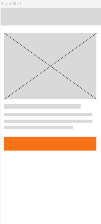
Grey boxes and Latin filler text aren't laziness — they're a deliberate choice to keep feedback focused on structure and flow. A reviewer looking at a full-color, polished-looking wireframe tends to comment on colors and fonts; a reviewer looking at grey boxes comments on layout and flow, which is exactly the feedback this stage needs.
| Element | How it's represented |
|---|---|
| Image or photo | A box with a diagonal X through it |
| Body text | Horizontal grey lines of varying width |
| A heading | A single, slightly thicker or wider grey line |
| A button | A rectangle, sometimes just outlined |
| Navigation | Simple boxes or a labeled bar, not final icon designs |
Low-fidelity wireframes are fast to make and fast to throw away — several rough versions can be sketched and compared in the time it takes to polish one. This is intentional: the earlier a bad structural idea gets caught, the cheaper it is to fix. The next lesson covers high-fidelity prototyping, once the structure is settled.
Paper is a legitimate wireframing tool
Many designers start wireframes on paper before ever opening Figma — a pencil sketch takes seconds to redraw, encouraging genuinely fast iteration in a way a digital tool sometimes doesn't.